
How flows work
Updated October 6, 2026
On this page
Everything you build in FlowNavi comes down to three things: flows, guides, and blocks. A flow is one experience for your users, it’s made of one or more guides, and each guide is put together from blocks.
A flow can be a product tour, a welcome message that leads into a tour, or an onboarding checklist. You build it in the editor, publish it, and it shows up in your app.
What a flow is made of
A flow is made of guides. A guide is one thing your users see on screen. There are five kinds:
- Tour: walks users through something step by step.
- Tooltip: explains one button, field, or setting, right where it is.
- Checklist: gives users a list of tasks to work through.
- Pop-up: shows a message over your app, such as a welcome, an announcement, or a survey.
- Banner: shows a notice across the top or bottom of your app.
Most flows are a single guide: one tour, or one tooltip.
What goes inside a guide
You put a guide’s content together from blocks. Click into the guide in the editor and use the + buttons to add one. There are five:
- Text: your message, with formatting like bold, lists, and links.
- Image: a picture, added by pasting a link to it.
- Video: a video from YouTube, Vimeo, Loom, or Wistia, added by pasting its link.
- Button: lets users do something: open a page, start another guide, or close the guide.
- Survey: asks users a question, such as an NPS score, a star rating, a choice between options, or an open answer.
You can place up to three blocks side by side, and add more rows below.
Not every guide takes every block:
- Tour steps and tooltips: text, images, video, and buttons
- Pop-ups: all five. A pop-up is the only place for a survey.
- Banners: text and buttons
- Checklist items: text only
How it fits together
Blocks make up a guide, and guides make up a flow.
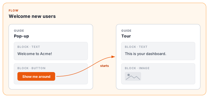
In this example, the flow “Welcome new users” has two guides: a pop-up and a tour. The pop-up is built from a text block and a button block, and its button starts the tour.
Combining guides
Put more than one guide in a flow when one should lead to the next:
- A welcome pop-up with a “Show me around” button that starts a tour
- A checklist where each item starts a tour for that task
- An announcement with a “Show me” button that starts a tour of the new feature
To connect two guides, add a button or a checklist item to the first one and choose Start as its action. You can start a tour, a checklist, or a pop-up this way.
Once a flow has several guides, you find them all under Guides in Flow settings at the top of the editor panel. Click one to edit it.
Who sees a flow, and when
You decide this once, for the first guide of the flow. By default it appears on its own when a user opens its page, and you choose who it appears for and how often. You can also add a launcher: a button in your app that users click to start the flow themselves.
Everything after the first guide is started by your users. If someone sees your welcome pop-up, they can click “Show me around” and take the tour, as often as they like. You don’t set an audience for the tour separately.
Publishing
You publish a flow as a whole. A welcome pop-up and the tour behind its button go live together, and when you archive the flow, both stop showing.
One flow or several?
If one guide starts another, they belong in the same flow.
If two guides have nothing to do with each other, like an onboarding tour and a maintenance banner, build them as separate flows. Then you can show each to different users and publish each when it’s ready.