
6 Best JavaScript Product Tour Libraries (Licenses Checked)
Intro.js and Shepherd.js are two of the four most-starred product tour libraries on GitHub. Both are licensed under AGPL, and both ask for a paid license once you ship them in a commercial product. The other two, Driver.js and React Joyride, are MIT.
I checked the license, bundle size, and framework support of six libraries against their repos in October 2026, then built the same 3-step tour in each one. The short answer comes first. The comparison table and the code follow.
Short answer: use Driver.js, or React Joyride if you’re on React
Driver.js is the default pick: MIT, 7.5 kB, any framework
Driver.js has the most GitHub stars of the six (26.9k), zero dependencies, and an MIT license. It is plain JavaScript, so it runs the same way in React, Vue, Angular, Svelte, or a server-rendered page. The latest release is from October 2026.
If you have no strong reason to pick something else, start here.
On React, go with React Joyride
React Joyride is a React component, so the tour lives in your component tree and reads your state like everything else in the app. It is MIT licensed and declares support for React 16.8 through 19.
It is the largest of the six at 25.6 kB gzipped. If that matters to you, Driver.js works in React too.
On Next.js with Tailwind, use Onborda
Onborda is built for the Next.js App Router. You write the tooltip as your own Tailwind component, Framer Motion animates it, and a step can move the user to another route.
One caveat before you commit: its latest npm release is from December 2024.
Alternative: No-code tours with FlowNavi
A library fits when a developer writes and maintains the tours. If the people who decide what a tour says are on the product or customer success team, FlowNavi is a no-code builder for the same job. More on library vs no-code further down.
Intro.js and Shepherd.js are not free for commercial use
Both are AGPL: ship one in a paid product and you need a license
Both libraries install from npm like any MIT package, which makes the license easy to miss. The npm registry lists each of them as AGPL-3.0.
AGPL lets you use the code for free if you publish the source of the application you build with it under the same terms. A closed-source SaaS product can’t do that, so both projects sell a commercial license:
- Intro.js: “If you want to use Intro.js for a commercial application, theme or plugin the commercial license is the appropriate license.” (repo)
- Shepherd.js: “Commercial license required for commercial products and revenue-generating companies.” (repo)
I’m a developer, not a lawyer. If your situation is unusual, read the license text yourself.
The license is cheap: $9.99 to $300, paid once
Neither library charges a subscription. Both sell lifetime licenses.
| 1 project | Up to 5 projects | Unlimited projects | |
|---|---|---|---|
| Intro.js | $9.99 | $49.99 | $299.99 |
| Shepherd.js | not offered | $50 | $300 |
So the license is a small line item. It’s still better to learn about it now than during a customer’s security review.
Driver.js, React Joyride, and Reactour are MIT: free to ship anywhere
MIT has no conditions on commercial use. You can ship these three in a paid product without buying anything or publishing your source.
Onborda also declares MIT in its package.json and on npm. Its repo has no separate license file, which some legal teams will ask about.
All 6 libraries compared in one table
| Library | License | Free in a commercial product | Size (gzipped) | GitHub stars | Latest release | Works with |
|---|---|---|---|---|---|---|
| Driver.js | MIT | Yes | 7.5 kB | 26.9k | 1.9.0, Oct 2026 | Any framework |
| React Joyride | MIT | Yes | 25.6 kB | 7.9k | 3.2.0, Jul 2026 | React 16.8 to 19 |
| Reactour | MIT | Yes | 7.2 kB | 4.1k | 3.8.0, May 2025 | React 16 to 19 |
| Onborda | MIT | Yes | 2.3 kB plus Framer Motion | 1.4k | 1.2.5, Dec 2024 | Next.js 13+, React 18+ |
| Intro.js | AGPL-3.0 or commercial | No, from $9.99 | 19.2 kB | 23.5k | 8.6.0, Sep 2026 | Any framework |
| Shepherd.js | AGPL-3.0 or commercial | No, from $50 | 15.3 kB | 13.8k | 15.3.0, Aug 2026 | Any framework |
Checked on October 6, 2026. All six ship TypeScript types.
Sizes are the minified and gzipped JavaScript as measured by Bundlephobia, without each library’s stylesheet. They are higher than the numbers on some of the libraries’ own homepages, so I used one source for all six to keep the comparison fair.
I built the same 3-step tour in all 6 libraries
The tour is the same everywhere: point at a “New project” button, then “Invite team”, then “Reports”. Each block below is the complete code for it.
1. Driver.js: my default pick for any stack
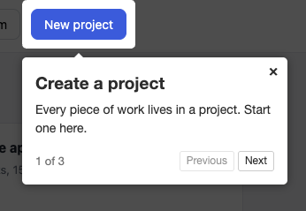
import { driver } from "driver.js";
import "driver.js/dist/driver.css";

const tour = driver({
  showProgress: true,
  steps: [
    {
      element: "#new-project",
      popover: {
        title: "Create a project",
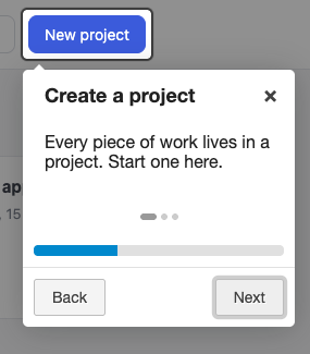
        description: "Every piece of work lives in a project. Start one here.",
      },
    },
    {
      element: "#invite-team",
      popover: {
        title: "Invite your team",
        description: "Add teammates so they can see the project.",
      },
    },
    {
      element: "#reports",
      popover: {
        title: "Track progress",
        description: "Reports show what is done and what is late.",
      },
    },
  ],
});

tour.drive();
One config object and one call. The overlay, the highlight, the Next and Previous buttons, and the “1 of 3” counter all come from the defaults.
- Best for: any app where you want a tour running today with nothing else to install.
- Watch out for: it is imperative code. In React you call it from an effect or a click handler, and it sits outside your component tree.
Driver.js also ships a separate hints module for standalone hotspots.
2. React Joyride: the safe choice on React, up to React 19
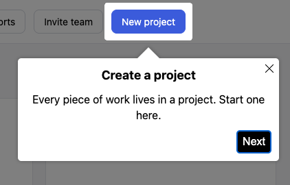
import { Joyride } from "react-joyride";

const steps = [
  {
    target: "#new-project",
    title: "Create a project",
    content: "Every piece of work lives in a project. Start one here.",
  },
  {
    target: "#invite-team",
    title: "Invite your team",
    content: "Add teammates so they can see the project.",
  },
  {
    target: "#reports",
    title: "Track progress",
    content: "Reports show what is done and what is late.",
  },
];

export function App() {
  return (
    <>
      <Joyride run continuous options={{ skipBeacon: true }} steps={steps} />
      {/* your app */}
    </>
  );
}
The tour is a component with props. run starts it, and continuous plays the steps in sequence with a Next button. By default each step first shows a pulsing beacon that the user clicks to open the tooltip. skipBeacon opens the tooltip directly. Because run is a prop, starting the tour from your own state (“this user is new”) is one expression.
There is also a useJoyride hook that returns controls for starting and stopping the tour from anywhere.
- Best for: React apps where the tour should react to app state.
- Watch out for: 25.6 kB gzipped and 10 dependencies, the heaviest of the six.
3. Reactour: pick it to assemble your own tour UI in React
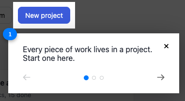
import { TourProvider, useTour } from "@reactour/tour";

const steps = [
  {
    selector: "#new-project",
    content: "Every piece of work lives in a project. Start one here.",
  },
  {
    selector: "#invite-team",
    content: "Add teammates so they can see the project.",
  },
  {
    selector: "#reports",
    content: "Reports show what is done and what is late.",
  },
];

function StartTour() {
  const { setIsOpen } = useTour();
  return <button onClick={() => setIsOpen(true)}>Take the tour</button>;
}

export function App() {
  return (
    <TourProvider steps={steps}>
      <StartTour />
      {/* your app */}
    </TourProvider>
  );
}
A step has a selector and content, and no title field. content accepts a string, a React element, or a function, so the inside of the popover is yours to design.
The project is split into separate packages: @reactour/tour, plus @reactour/mask and @reactour/popover if you only want the highlight or the popover on their own.
- Best for: React teams that want a small tour (7.2 kB gzipped) with their own components inside it.
- Watch out for: the latest release is from May 2025. It declares React 19 support, but it moves slowly.
4. Onborda: made for Next.js and Tailwind, a poor fit anywhere else
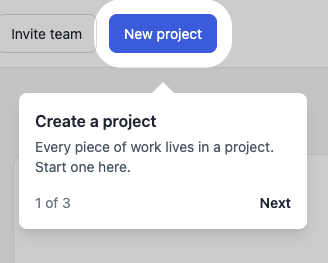
"use client";
import { Onborda, OnbordaProvider, useOnborda } from "onborda";

const tours = [
  {
    tour: "welcome",
    steps: [
      {
        icon: null,
        title: "Create a project",
        content: "Every piece of work lives in a project. Start one here.",
        selector: "#new-project",
        side: "bottom",
      },
      {
        icon: null,
        title: "Invite your team",
        content: "Add teammates so they can see the project.",
        selector: "#invite-team",
        side: "bottom",
      },
      {
        icon: null,
        title: "Track progress",
        content: "Reports show what is done and what is late.",
        selector: "#reports",
        side: "bottom",
      },
    ],
  },
];

function TourCard({ step, currentStep, totalSteps, nextStep, prevStep, arrow }) {
  const { closeOnborda } = useOnborda();
  const isLast = currentStep === totalSteps - 1;
  return (
    <div className="w-72 rounded-lg bg-white p-4 shadow-lg">
      <h3 className="font-semibold">{step.title}</h3>
      <p className="mt-1 text-sm text-gray-600">{step.content}</p>
      <div className="mt-4 flex items-center justify-between text-sm">
        <span className="text-gray-500">
          {currentStep + 1} of {totalSteps}
        </span>
        <div className="flex gap-3">
          {currentStep > 0 && <button onClick={prevStep}>Back</button>}
          <button className="font-semibold" onClick={isLast ? closeOnborda : nextStep}>
            {isLast ? "Done" : "Next"}
          </button>
        </div>
      </div>
      <span className="text-white">{arrow}</span>
    </div>
  );
}

function StartTour() {
  const { startOnborda } = useOnborda();
  return <button onClick={() => startOnborda("welcome")}>Take the tour</button>;
}

export function Providers({ children }) {
  return (
    <OnbordaProvider>
      <Onborda steps={tours} cardComponent={TourCard}>
        <StartTour />
        {children}
      </Onborda>
    </OnbordaProvider>
  );
}
This is the longest of the six, because Onborda 1.2.5 renders nothing until you pass it your own card component. You write the tooltip, its buttons, and the step counter yourself. Onborda handles the highlight, the positioning, and the animation.
You wrap your root layout in two providers and start a tour by name. Its layout classes come from Tailwind, so you also add ./node_modules/onborda/dist/**/*.{js,ts,jsx,tsx} to the content list in your Tailwind config.
Two features set it apart. Tours are named, so one config holds several. And a step can carry nextRoute and prevRoute, which moves the user to another page as the tour advances.
- Best for: Next.js apps already on Tailwind and Framer Motion.
- Watch out for: there is no ready-made tooltip, it requires Next.js 13+, React 18+, and Framer Motion 11+ as peer dependencies, and its latest release is from December 2024.
5. Intro.js: 23k stars, but budget $9.99 for the license
import introJs from "intro.js";
import "intro.js/introjs.css";

introJs
  .tour()
  .setOptions({
    showProgress: true,
    steps: [
      {
        element: "#new-project",
        title: "Create a project",
        intro: "Every piece of work lives in a project. Start one here.",
      },
      {
        element: "#invite-team",
        title: "Invite your team",
        intro: "Add teammates so they can see the project.",
      },
      {
        element: "#reports",
        title: "Track progress",
        intro: "Reports show what is done and what is late.",
      },
    ],
  })
  .start();
The code is as short as Driver.js. Intro.js can also read steps straight from data-intro attributes in your HTML, which suits server-rendered pages.
It is the only one of the six with a built-in “Don’t show again” checkbox (dontShowAgain), which stores the choice in a cookie.
- Best for: teams that want that checkbox out of the box, or that already use Intro.js and are happy with it.
- Watch out for: the AGPL license. A commercial product needs the paid license, from $9.99 for one project.
6. Shepherd.js: budget $50 before you ship it in a paid product
import Shepherd from "shepherd.js";
import "shepherd.js/dist/css/shepherd.css";

const tour = new Shepherd.Tour({
  useModalOverlay: true,
  defaultStepOptions: {
    buttons: [
      { text: "Back", action: () => tour.back() },
      { text: "Next", action: () => tour.next() },
    ],
  },
});

tour.addSteps([
  {
    title: "Create a project",
    text: "Every piece of work lives in a project. Start one here.",
    attachTo: { element: "#new-project", on: "bottom" },
  },
  {
    title: "Invite your team",
    text: "Add teammates so they can see the project.",
    attachTo: { element: "#invite-team", on: "bottom" },
  },
  {
    title: "Track progress",
    text: "Reports show what is done and what is late.",
    attachTo: { element: "#reports", on: "bottom" },
  },
]);

tour.start();
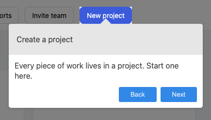
Shepherd makes you spell out more. You define the buttons yourself and say where each tooltip attaches.
That explicitness pays off in tours that follow what the user does. advanceOn moves to the next step when the user clicks a real element in your app, and beforeShowPromise holds a step back until something async has finished, like a panel loading.
- Best for: interactive walkthroughs where steps wait for the user or for your app.
- Watch out for: the AGPL license. A commercial product needs the paid license, $50 for up to 5 projects.
Skip these 3: Hopscotch, Bootstrap Tour, and Trip.js are abandoned
These three still appear in library roundups.
- Hopscotch: LinkedIn archived the repo. The last npm release is from June 2017.
- Bootstrap Tour: the last npm release is from October 2017.
- Trip.js: the last release is from April 2019.
A tour library sits on top of your UI and breaks when browsers and frameworks change, so pick one that still gets releases.
One naming note: the archived Hopscotch library from LinkedIn has nothing to do with the Hopscotch product tour software covered in my Hopscotch alternatives post.
A library only draws the tour. You build these 3 things yourself
All six libraries do the same job: highlight an element, show a tooltip next to it, and move to the next step. Everything around that is your code.
Deciding who sees the tour
A library shows the tour when you call start(). Whether this user should see it at all is logic you write: new signups only, admins only, users on the plan that has the feature.
That is simple for one tour. It grows with every tour you add and every rule the product team asks for.
Remembering who already saw it
None of the six stores which user has finished or dismissed a tour. Without that, the tour comes back on every page load.
Intro.js gets closest with its “Don’t show again” cookie, which covers one browser. To remember a user across devices, you add a flag to your own database and check it before starting the tour.
Finding the step where users quit
Every library gives you callbacks or events for step changes, completion, and dismissal. None of them sends that data anywhere.
To learn that users give up at step 2, you forward those events to your analytics tool and build the report there.
Library or no-code tool? Decide with 2 questions
Do developers own the tours? Use a library
A library is the right call when a developer writes the tour, the tours are few, and they rarely change. It costs nothing or close to it, it stays in your codebase, and you control every pixel.
Does the product team change them often? Use a no-code tool
With a library, every wording change is a code change, a review, and a deploy. That is fine a few times a year.
If a product manager wants to try a different first step this week and a different audience next week, the tours have become a queue of small tickets for your developers. A no-code tool moves that work to the people who own the tours. Product tour best practices covers what they’ll want to iterate on.
FlowNavi: product tours with no code, from $79/month
Disclaimer: FlowNavi is the tool we’re building.
Build the tour on your live product
You build a tour on top of your own running product: pick the element, write the step, and see it the way your users will. Changing the wording later needs no deploy.
Show it only to the right role, plan, or signup date
Each tour has audience rules based on attributes you already store, like role, plan, and signup date. You can show a tour only to users who haven’t finished setup, or start the next one when a user finishes the last.
See the exact step where users drop off
Every tour has a report that shows how many users finished each step. A sharp drop between two steps shows where users give up.
Checklists, tooltips, and surveys come in the same plan
Onboarding checklists, standalone tooltips, in-app announcements, and surveys are included on every plan.
See how FlowNavi product tours work.
FAQ
Is Intro.js free for commercial use?
No. Intro.js is licensed under AGPL-3.0, and its maintainers require a commercial license for commercial applications. A lifetime license costs $9.99 for one project, $49.99 for five, and $299.99 for unlimited projects. It is free for open source and non-commercial projects.
Is Shepherd.js free for commercial use?
No. Shepherd.js is AGPL-3.0 and requires a commercial license for commercial products. A lifetime license costs $50 for up to five projects and $300 for unlimited projects. Open source and non-commercial use is free.
Which product tour library has the smallest bundle?
Of the six, Onborda’s own code is the smallest at 2.3 kB gzipped, but it needs Framer Motion alongside it. Among libraries with no extra requirements, Reactour (7.2 kB) and Driver.js (7.5 kB) are the smallest. React Joyride is the largest at 25.6 kB.
Does Driver.js work with React, Vue, and Angular?
Yes. Driver.js is plain JavaScript with zero dependencies, so it runs in any framework. You call it from your component code and point each step at a CSS selector or a DOM element.
Which product tour library supports React 19?
React Joyride and Reactour both list React 19 in their peer dependencies. Onborda requires React 18 or newer. Driver.js, Intro.js, and Shepherd.js don’t depend on React at all, so they work with any version.